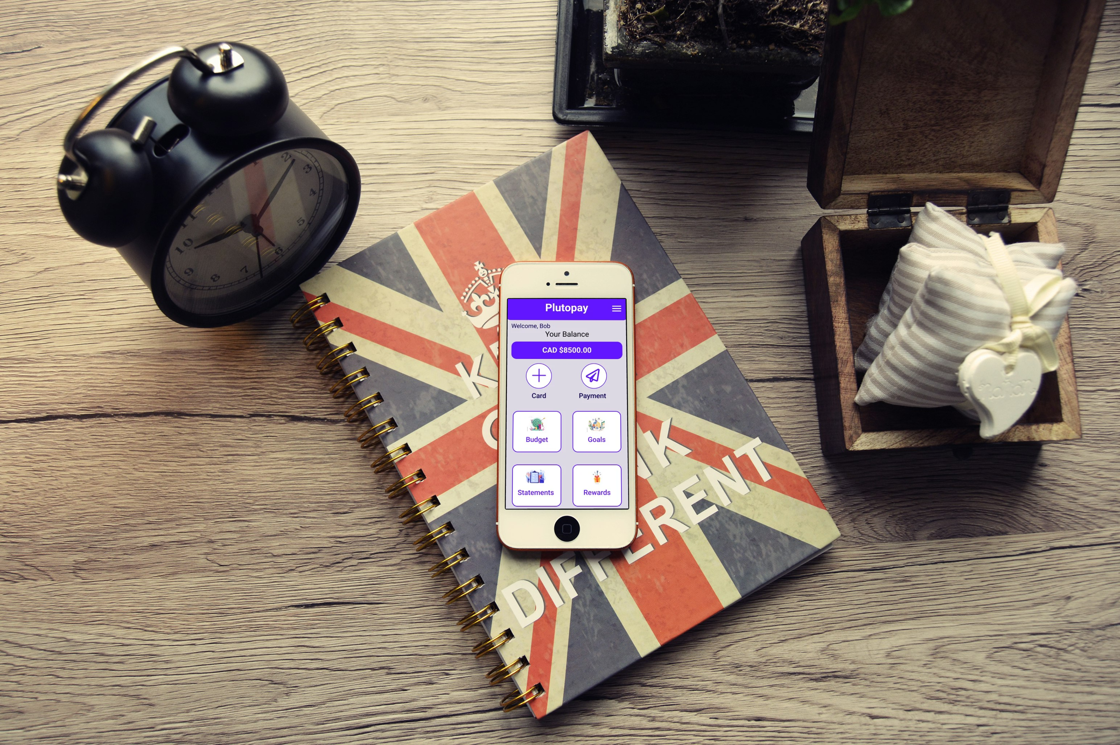
Title: Plutopay
Context: PlutoPay is a responsive web application allowing anyone to manage their bank accounts, transfer money without a debit or credit card, or visit a physical bank or store. PlutoPay will enable users to manage their financial needs in one place.
Problem: When People of all ages use multiple cards to shop online and transfer money.
Gap: The e-commerce trend has been catalyzed by the global coronavirus pandemic in 2020, forcing many people to stay inside, wary of going to the store and using their physical cards to pay for items.
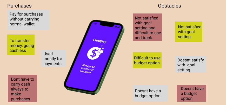
Solution: An application with features like authorization required when pre-defined threshold limits are reached by the user, transactions that provide a cashback incentive for the money spent, and the ability to set goals and create a budget for spending.
My Role: UX/UI Designer
Tools & Resources: Figma, Optimal Workshop, Usability Hub, Google Meet & Microsoft Office Tools
Project Scale: March 2023 - June 2023

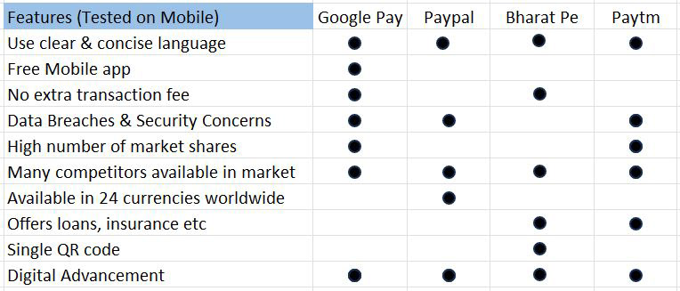
COMPETITIVE ANALYSIS
USER INTERVIEWS AND SURVEYS
I conducted User Interviews and Surveys with 3 people from different backgrounds to get insights.
User interviews with an online survey helped me to understand the needs and goals of the users and to gain insights into what features users participate in and use most of their pain points in using the digital application.
Below is an affinity map summarizing key interview insights and takeaways.
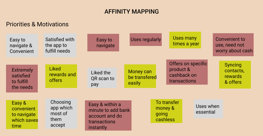
INSIGHTS FROM USER INTERVIEWS
Most users use payment options only.
Users do not like to explore more options as they are not comfortable using them, and it is difficult and confusing to incorporate them into their daily routines.
Users like the features, offers, and rewards they get, using the application that encourages them.
Users want to know their money can be quickly and easily transferable/delivered with security.
Users are looking to access the features that are convenient for them to use.

USER PERSONAS
User personas were created to ensure that the focus for development would be centered around our users. Information gathered from interviews and research is what makes up our personas' goals and behaviors. Fulfilling user persona needs/goals reflects the needs of our target audience.
Below are examples of Personas I have created

Brad
54, USA
M.B.A
Married, 2 Children
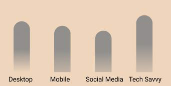
Device Usage Profile
Behavior & Activities Motivations Needs & Goals Frustrations
Businessman When Navigation is simple Transfer money when needed When money transfer is
To transfer funds with Receiving rewards the When features are user-friendly Cumbersome
security money spent and easy to navigate
Quote: “He wants to transfer money when needed to his family & friends which is quick, secure, and simple to
use”.

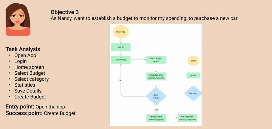
Nancy
38, USA
B.E.
Married, 1 Child
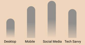
Device Usage Profile
Behavior & Activities Motivations Needs & Goals Frustrations
Software Engineer To stay within budget Reduce overspending When exceeds her budget
Keep track of her expenses To achieve her goal Keep track of spending Not achieving her goal
Goal to purchase a new car
Quote: “She wants to keep track of her expenses so that it doesn't exceed her budget and fulfill her goal of buying a new Car."
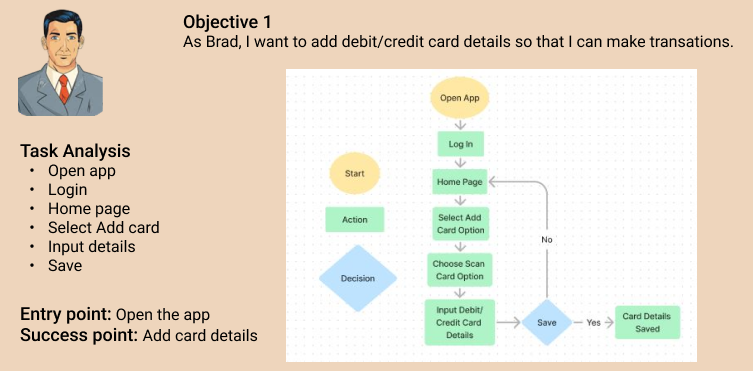
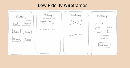
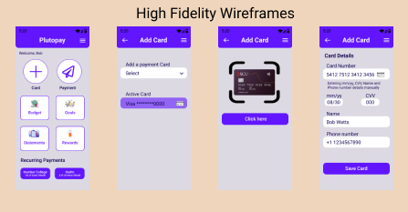
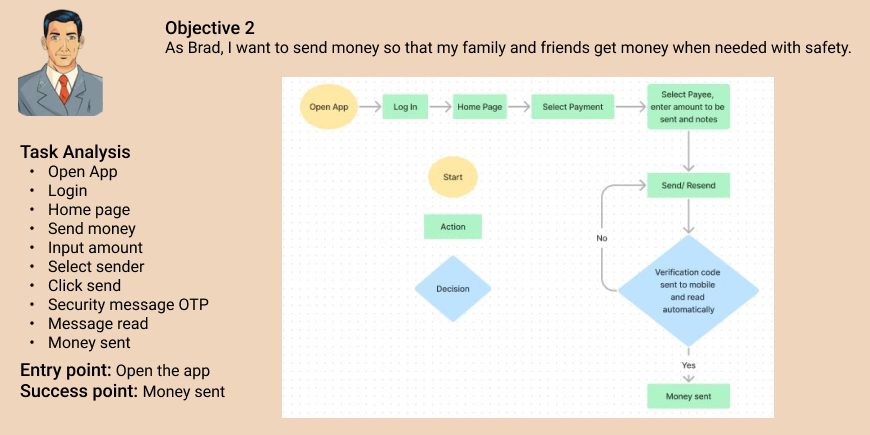
USER FLOWS
I have developed user flows for our user personas to ensure that our web-responsive application provides a user-centered experience. These flows help us determine the number of screens users need to navigate to achieve their goal. By creating user flows for Digital wallets, we can offer intuitive navigation that is helpful for Users.
Below are examples of User flows I have created


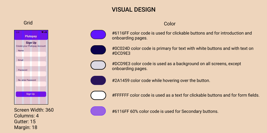
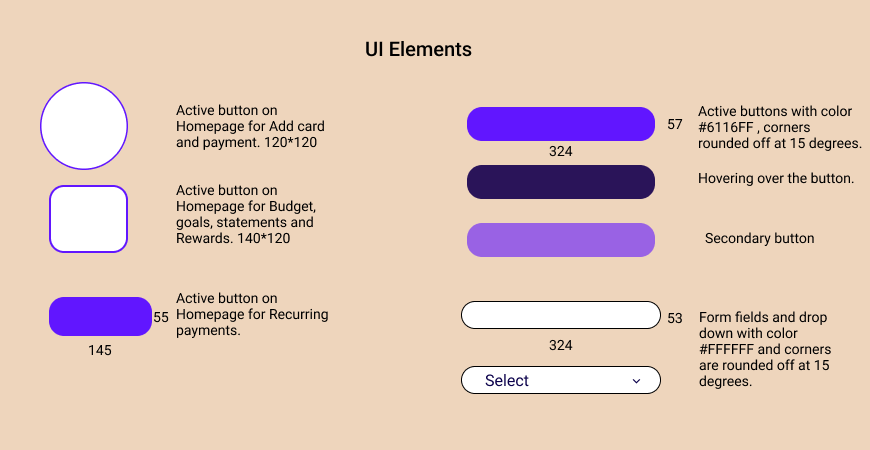
Typography
ROBOTO
Header 1-40 pts Extra bold text for Onboarding pages
Header 2-32 pts bold text for Title on all pages
Header 3-30 pts semi-bold text for Onboarding pages
Header 4-26 pts regular text for Onboarding pages for Skip
Header 5-24 pts regular text
Header 6-22 pts regular text
Body 18 pts regular
Header 2-32 pts bold text for Title on all pages
Header 3-30 pts semi-bold text for Onboarding pages
Header 4-26 pts regular text for Onboarding pages for Skip
Header 5-24 pts regular text
Header 6-22 pts regular text
Body 18 pts regular
Preference A/B Testing:
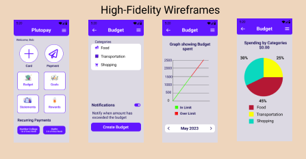
After creating 2 high-fidelity design options for the Plutopay introduction Onboarding screen, Login screen, and Homepage screens, I ran preference tests to determine which designs users preferred and why.
Preference Test #1: Introduction and onboarding Screen
The preference test was conducted virtually via Usability Hub with 10 responses. The only difference I wanted to test between these 2 screens was the color and readability that users will see upon opening the app to determine which one user preferred and why. Both options and subsequent results can be found below.
Option A
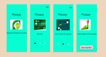
Option A(40%)
Great UI
Looks easy
Green works with money
Difficult to choose the purple one
Option B
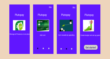
Option B (60%)
Looks bright & different
Looks easy & readable
Color is different & good
Readability is good
This is easy to read
The purple color looks good & appealing
Conclusion
Users (40%) prefer Option A and (60%) for Option B due to its more obvious alignment with the purpose/name of the app. Users liked both the options and the changes were color. Based on the results, I will likely go with Option B.
Preference Test #2 Login Screen
The preference test was conducted virtually via Usability Hub with 10 responses. Here, I wanted to test the difference between 2 different overall styles and “feels” that the app would convey to users.
Option A
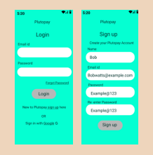
Option A(10%)
The other one looks too bright
Option B
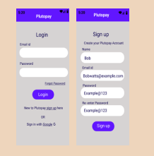
Option B(90%)
The accent color shows a better hierarchy
Simple & easy
Color is more appealing to me
The grey background color is more comfortable for the eyes
Looks soothing
These pages appear to be more user-friendly with a header
These colors are more relaxing to my eye
Readable
Like the purple button for the actions, they are easier to see
Conclusion
Users (10%) prefer Option A and (90%) for Option B due to its more obvious alignment with the button, appealing color, and design. Users liked Option B the difference is 99% likely statistically significant. This means that you can be very confident that it is better, and not performing better due to random chance. Based on the results, I will likely go with Option B
TAKEAWAYS
I have learned so much through the Journey of Plutopay, from conducting user research, user interviews, usability testing, implementing Material Design Guidelines, and collaborating with others to improve Plutopay.
A lot of Plutopay comprised iterations that were based on qualitative and quantitative data that were collected through testing. Being a designer, it’s difficult to abandon a certain direction of your project because of the attachment and time invested in it.
All the iterations, whether the design fundamentals or the information architecture, will continuously evolve concerning usability and preferences. The key to future projects and further improvements is for me to grow and evolve. Plutopay can benefit from more iterations catering to accessibility or visual aesthetics.